Plotting views
FSLeyes 1.17.0.dev3+g17714d594 provides three plotting views:
The Time series view plots voxel intensities from 4D NIFTI images.
The Power spectrum view is similar to the time series view, but it plots time series transformed into the frequency domain.
The Histogram view plots a histogram of the intensities of all voxels in a 3D NIFTI image (or one 3D volume of a 4D image).
All of these views have a similar interface and functionality - they can plot data series from multiple overlays and multiple voxels, and you can also import and export data series.
Time series view
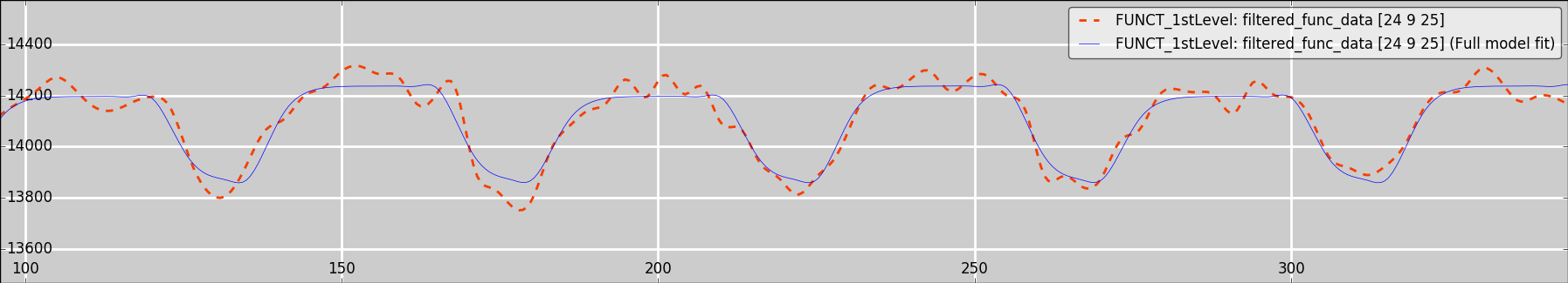
The time series view plots voxel intensities from 4D NIFTI images. It is also capable of displaying various FEAT analysis outputs, and MELODIC component time series - refer to those pages for more details.
When you are viewing a 4D NIFTI image in an orthographic or lightbox view, the time series view will update as you change the display location, to show the time series from the voxel (or voxels, if you have more than one 4D image loaded) at the current location. Clicking, or clicking and dragging on the time series plot will update the volume that is displayed for the currently selected image. You can use the plot toolbar or plot list to “hold” the time series for one or more voxels, which will keep them on the plot after you change the display location.
The plot control panel (described below) contains some settings specific to time series plots:

Plotting mode This setting allows you to scale or normalise the time series which are displayed. You can plot the “raw” data, demean it, normalise it to the range
[-1, 1], or scale it to percent-signal-changed (suitable for FMRI BOLD data).Use pixdims This setting is disabled by default. When enabled, the
pixdimfield of the time dimension in the NIFTI header is assumed to contain the TR time, and is used to scale the time series data along the X axis. Effectively, this means that the X axis will show seconds. When disabled, the X axis corresponds to the volume index (starting from 0) in the 4D image.Plot component time courses for Melodic images This setting is enabled by default. If the currently selected overlay is the
melodic_ICfile from a MELODIC analysis, the component time series for the current component (the current volume in the image) is shown, instead of the voxel intensity across all components. See the page on IC classification for more details.
Power spectrum view
The power spectrum view performs a similar role to that of the time series view, but the time series are transformed into the frequency domain before being plotted.
The plot control panel for a power spectrum view contains the following settings:
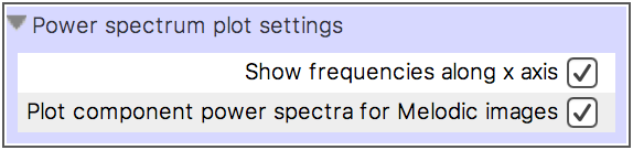
Show frequencies along the X axis This setting is enabled by default. When selected, the X axis values are transformed into frequencies, using the TR time specified in the NIFTI file header. Otherwise, the X axis values are simply plotted as indices.
Plot component power spectra for Melodic images In the same manner as the time series view, if the currently selected overlay is a
melodic_ICimage, the power spectrum (pre-calculated by MELODIC) for the current component will be plotted.
One further setting is available for each data series displayed on a power spectrum view (in the Plot settings for selected overlay section of the plot control panel, described below):
Normalise to unit variance This setting is enabled by default. When selected, the time series data is normalised before being transformed into the frequency domain, by subtracting its mean, and dividing by its standard deviation.
Histogram view
The histogram view plots a histogram of the intensities of all voxels in a 3D NIFTI image, or of the current 3D volume in a 4D image. Both the plot toolbar and plot control panel allow you to choose between displaying the histogram data series as probabilities, or as counts.
The following settings will be displayed on the plot control panel for a histogram view, allowing you to customise the histogram for the currently selected image:
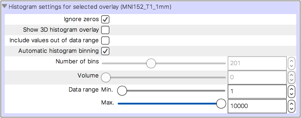
Ignore zeros This setting is selected by default. When selected, voxels which have an intensity equal to 0 are excluded from the histogram calculation.
Show 3D histogram overlay When this setting is selected, a mask overlay is created, which displays the voxels that have been included in the histogram calculation. See the sidebar for more details.
Include values out of data range When this setting is selected, the histogram will be updated so that the first and last bins contain voxels that are outside of the Data range.
Automatic histogram binning This setting is selected by default. When selected, the Number of bins is automatically set according to the data range.
Number of bins When Automatic histogram binning is disabled, this setting allows you to adjust the number of bins used in the histogram calculation.
Volume If the currently selected overlay is a 4D NIFTI image, this slider allows you to choose the 3D volume used in the histogram calculation.
Data range This setting allows you to control the data range that is included in the histogram calculation.
Controlling what gets plotted
Each of the plotting views allow you to plot data series for multiple overlays, and for multiple voxels. You can also import arbitrary data series from a text file, and export the data series that are plotted.
The overlay list allows you to toggle the data series for each overlay on and off.
The plot toolbar contains controls allowing you to import/export data series, and to “hold” data series for the current voxel.
The plot list allows you to customise the data series that have been “held” on the plot.
The overlay list
The overlay list which is available on plotting views is slightly different to
the one available in orthographic/lightbox views. It simply displays a list of all loaded
overlays, and allows you to toggle on and off the data series associated with
each overlay, by clicking the ![]() button next to each overlay’s name.
button next to each overlay’s name.
The plot toolbar
Each plotting view has a toolbar which contains some controls allowing you to do the following:

Plot control panel This button opens the plot control panel, which contains all available plot settings.
Plot list This button opens the plot list, which allows you to add and remove data series, and to customise the ones which are currently being plotted.
Screenshot This button allows you to save the current plot as a screenshot.
Import data series This button opens a file selection dialog, with which you can choose a file to import data series from.
Export data series This button allows you to export the data series which are currently plotted to a text file.
Add data series This button “holds” the plotted data series for the currently selected overlay, at the current voxel.
Remove data series This button removes the most recently “held” data series from the plot.
Holding data series and the plot list
When you are viewing time series for voxels in a 4D NIFTI image, it can be useful to view the time series at different voxels simultaneously.
You can accomplish this by “holding” the time series for the voxels in question - when you push the + button on either the plot toolbar or the plot list, the time series (or power spectrum) for the currently selected overlay, at the current voxel, will be added to the plot list, and will be held on the plot. All data series that have been added to the plot list will remain on the plot, even after you have selected a different overlay or moved to a different voxel.
The plot list allows you to manage all held data series:
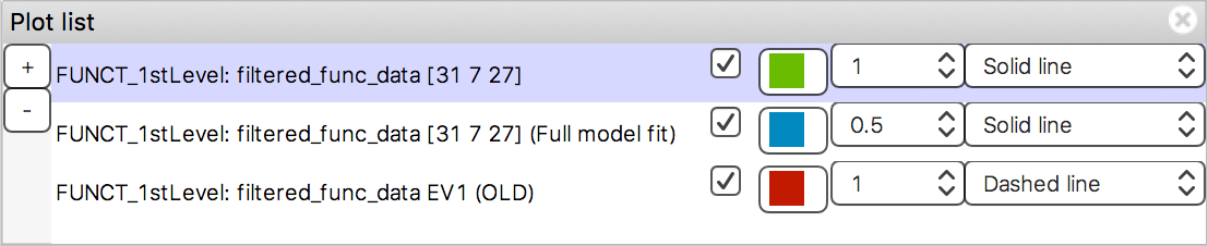
Through the plot list, you can add/remove data series, and customise the appearance of all data series that have been added to the plot.
Importing/exporting data
The Import data series button ![]() on the plot
toolbar allows you to import data series from a
text file to plot alongside the image data.
on the plot
toolbar allows you to import data series from a
text file to plot alongside the image data.
For example, FEAT and MELODIC analyses typically contain estimates of subject motion, generated by the MCFLIRT tool. It can sometimes be useful to plot these estimates alongside the voxel time series, to visually check for motion-related correlations and artefacts.
When you import data series from a file, FSLeyes will ask you how the data series are to be scaled on the X axis:
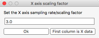
If the first column in your data file contains the X axis data, click the First column is X data button. Otherwise, FSLeyes will set the X axis data according to the value that you enter [*].
The Export data series button ![]() on the plot
toolbar allows you to save the data series that are
currently plotted to a text file in the format described in the sidebar. To export data series of
different lengths and sample rates out to the same text file, FSLeyes applies
linear interpolation, and pads shorter data series with
on the plot
toolbar allows you to save the data series that are
currently plotted to a text file in the format described in the sidebar. To export data series of
different lengths and sample rates out to the same text file, FSLeyes applies
linear interpolation, and pads shorter data series with nan.
Customising the plot (the plot control panel)
The plot control panel contains all of the settings available for customising how each plotting view behaves, and how it looks. The available settings are organised into three groups:
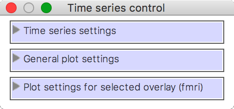
The view-specific settings (Time series settings in the above example) have been covered above, in the sections on the time series, power spectrum, and histogram views. The General plot settings and Plot settings for selected overlay groups are the same across all plotting views.
A fourth group of settings may be present, depending on the plotting view type (e.g. the histogram settings), and on the overlay type (e.g. FEAT images).
General plot settings
This group of settings allows you to control how the plot looks and how it behaves:

Log scale (x axis) When selected, the base 10 logarithm of the X axis data will be displayed.
Log scale (y axis) When selected, the base 10 logarithm of the Y axis data will be displayed.
Smooth When selected, each data series is upsampled and smoothed (see the sidebar).
Show legend Toggle the plot legend on and off.
Show ticks Toggle the plot ticks on and off.
Show grid Toggle the plot grid on and off.
Grid colour This setting allows you to change the plot grid colour.
Background colour This setting allows you to change the plot background colour.
Auto-scale (x axis) This setting is selected by default. When selected, the X axis limits are automatically scaled to fit the data series that are plotted.
Auto-scale (y axis) This setting is selected by default. When selected, the Y axis limits are automatically scaled to fit the data series that are plotted.
X limits If Auto-scale is disabled for the X axis, this setting allows you to manually specify the X axis limits.
Y limits If Auto-scale is disabled for the Y axis, this setting allows you to manually specify the Y axis limits.
Labels Set the X and Y axis labels here.
Plot settings for selected overlay
This group of settings allows you to control how the data series for the current overlay is plotted.
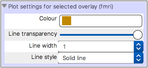
You can customise the data series line colour, transparency, width, and style - available styles are Solid line, Dashed line, Dash-dot line, and Dotted line.